The Story of the Logo
The story behind the Rainy River District Ontario Health Team logo begins with ideas, discussed and shared between all partner health organizations and the regional First Nations. These ideas included:
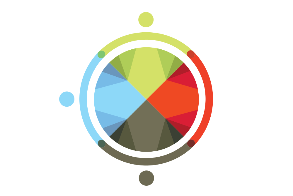
- The Circle : Shows partnership, unity, balance
- Interconnectedness : Between all people and the land.
- Elements : Natural medicines and elements.
- The Drum : To represent the four drums which are the keepers of the 10 area First Nation communities: The Big Island Drum, the Big Grassy Drum, the Manitou Drum, and the Mother Drum.
There is healing in the drums.

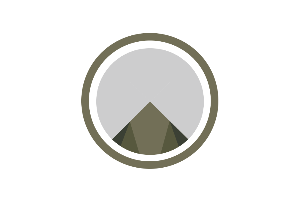
The Circle
The main image in the centre of the logo is a drum.
The colours on the drum skin represent the cultural diversity of the area communities. There are 20 shapes which when fit together represent the Rainy River District Ontario Health Team partners. Ten for the local health organizations, and 10 for the area First Nations.
The Colours
Each colour has been carefully chosen to represent a natural element that is important to our region and our way of life. In addition to the natural element, we have associated each colour with a traditional medicine.

Green
Natural element : The land, and the elders
Traditional medicine : Sweetgrass

Blue
Natural element : The water
Traditional medicine: the blueish purple blooms of the sage plant
Grey / Brown
Natural element : The rock, and the soil
Traditional medicine : Tobacco

Red
Natural element: The vibrant sunsets
Traditional medicine : Cedar
The Connection
Joining together around the drum, are a partnership of people, working in unison. Connected together, helping each other, supporting.

The Heart
The logo brings together the natural, the spiritual, and the technological. Running through the centre of the logo is an ECG line, showing the rhythm of a patient’s heartbeat. It represents the care provided by the health organizations that make up the partnership.
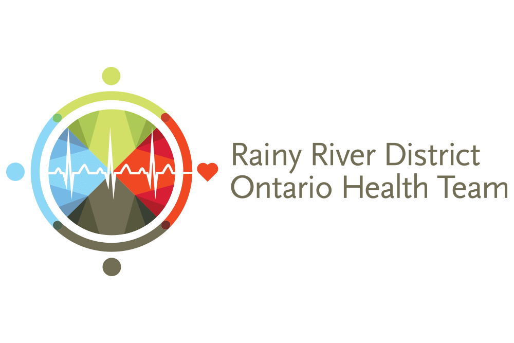
The RRDOHT Logo
When all the colours are put together, we have a vibrant palette that represents the natural surroundings, and also the people of this region. It also forms four direction shapes of the traditional medicine wheel. These directions represent the four stages of life: baby, youth, adult, elder.
Rainy River District Ontario Health Team | Web Design by Studio Gibbous